
5 Common Flaws That Are Silently Killing Your Leads and Revenue
Is Your Website a Boss or Just a Business Card?

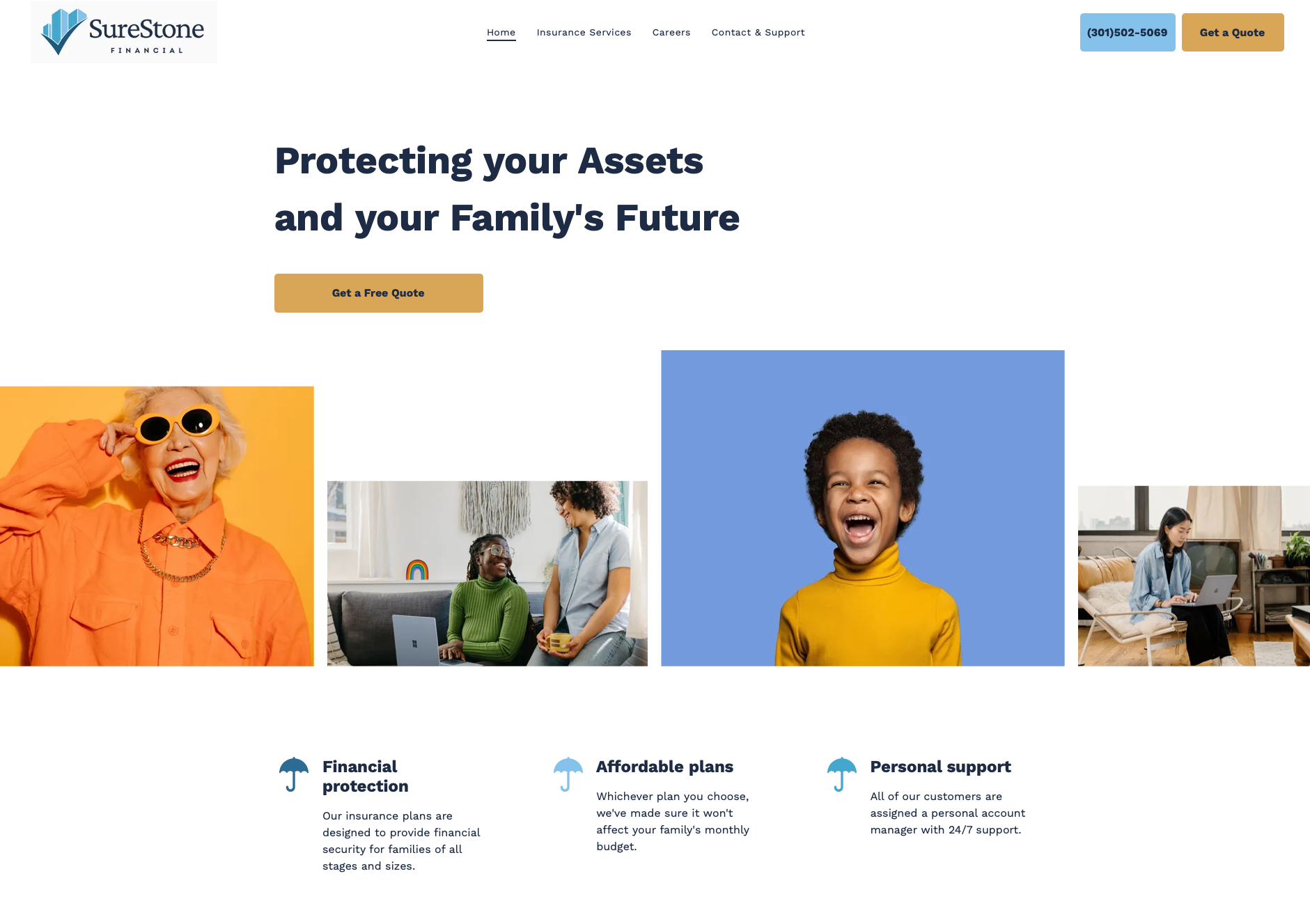
Your website is more than just a digital placeholder, it's your hardest working employee. It works 24/7, connects with potential customers, captures leads, and either builds your brand into an authority or leaves it looking amateurish.
But if you’re a solopreneur, a new business owner trying to make its mark online, you might be unintentionally losing money and opportunities. These aren't huge, flashy errors; they're small, compounding mistakes that slowly erode trust and turn potential customers away.
Let’s dive into the five biggest offenders and how to transform your site from a digital liability into a powerful asset.
1. Your Homepage Is a Riddle, Not a Resource
Imagine someone landing on your homepage and, after a few seconds, still having no idea what you do. This isn't a game of hide-and-seek; it's a critical failure. Your visitors should instantly understand your value.
The Fix: Make your value proposition crystal clear and put it front and center. Use a headline that immediately explains who you help, how you help them, and what they should do next.
- Example: "We design custom websites that help churches and small businesses grow their communities and bottom line."
2. Your Site Ignores the Mobile Revolution
Over 60% of all website traffic comes from mobile devices. If your site looks like it was built in 2009 for a desktop monitor with tiny text, sideways scrolling, and hard-to-click buttons, you're turning away the majority of your audience. Google even penalizes sites that aren’t mobile-friendly, hurting your search rankings.
The Fix: Use Google's free Mobile-Friendly Test to see how your site performs. Ensure all elements are easy to see and interact with on a phone or tablet.
- Pro-Tip: Ditch tiny pop-ups and hidden menus. Everything should be intuitive, fast, and easy to navigate with a thumb.
3. You're Missing a Call to Action (CTA)
So, someone visits your site, loves what they see, and… then what? Without a clear call to action (CTA), you're letting valuable leads slip through your fingers. A website without a way to capture interest is just an online brochure, not a business tool.
The Fix: Make it easy for people to take the next step. Every page should have a single, clear CTA. This could be a button to "Book a Call," "Download Our Guide," or "Get Started."
- Pro-Tip: Use automation tools like Make.com or GoHighLevel to automatically follow up with leads, ensuring no one gets left behind.
4. Your Design Is Visual Chaos
Think of a messy desk. You know everything you need is there, but it takes forever to find it. A cluttered, confusing website design does the same thing to your visitors. It’s not about using the fanciest fonts or the brightest colors, it's about creating a clear, focused, and trustworthy user experience.
The Fix: Simplify. Stick to just one or two fonts and use a clear visual hierarchy with prominent headlines and readable body text. Follow the 3-click rule to ensure visitors can find what they need in three clicks or less.
- Pro-Tip: Give your design elements room to breathe. Use negative space to guide the user's eye and make important information stand out.
5. Your Site Is a Ghost Town
One of the biggest mistakes is treating your website like a one-and-done project. You launched it, and now you’ve moved on. A static, forgotten website looks old and untrustworthy. A thriving site, on the other hand, shows your business is active and growing.
The Fix: Treat your website as a living, breathing part of your business. Regularly update your blog, add new client testimonials as you get them, and refresh photos or services quarterly.
Your Website Is a Tool, Not a Trophy
If your website just "exists," it’s not doing its job. But when you treat it as a strategic tool designed to communicate, build trust, and convert interest into income, it will pay for itself many times over.
Ready to see if your website is costing you money? I'm happy to take a look and provide honest, actionable feedback on what's working and what's not.
Book a Free Discovery Call Today